Tampilkan postingan dengan label Photoshop. Tampilkan semua postingan

How to Make a Power Blast


How to Make a Power Blast

Choose Your source
    • The blast has to come from somewhere. I put a circle here for tutorial purposes but you just pretend it's a gun muzzle or someones hand


Make the base of the bolt
    • Use the polygon lasso tool and click out a blast beam selection in perspective like you see here. Make sure it's on it's own layer. Fill with a good bolt color. (light blue, purple, green, and red are good). Make sure it's a bright color on the high saturation


Getting in touch with your inner bolt
    • Now, create a new blank layer above the outer bolt. ctrl+click on the outerbolt layer to make the bolt a selection. Contrast this selection by a few pixels and fill this new contracted selection with white on it's own layer. You should now have something like you see here


Blurry
    • Apply a gaussian blur to each layer. Play with the settings. (I used a 2,5 pixel blur). You may need less or more depending on the size of your picture. This technique also makes a good light saber


Snap, crackle, and pop
    • On another new blank layer, grab your paintbrush, set it to 1 pixel, 100% opacity, normal blendingmode, and brush out some lightning forks along the beam


Glow
    • If you have photoshop 5 or higher, you can apply the "outer glow" layer effect to the lightning layer. Use the eyedropper to select the outer glow color from the beam itself and then you're done


This material is taken from www.tutorialguide.net

Sony Ericsson Logo

Special Tutorial [ Sony Ericsson Series ]


ni bwat memperingati hari lahirna dremi.info 05 mei 2005, tepat bulan ini 05 mei 2008, ultah yang ke - 3 . gw mao bikin tutorial khusus bertema sony ericsson series.


karena kecintaan gw ma label sony ini, untuk session pertama tutorial sony ericsson series ini gw mao bikin logona dlu.


wuki... mudah2an bisa mirip ma yang asli na hihik... :D


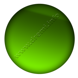
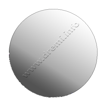
bwat dokumen .. ukuran seperluna sajah.. gw pake shapping elipse tool


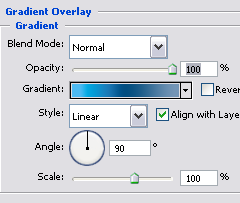
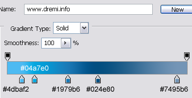
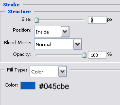
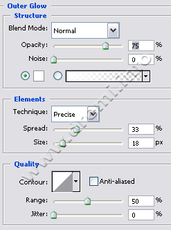
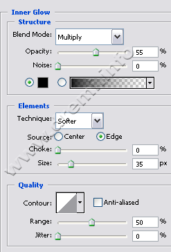
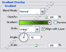
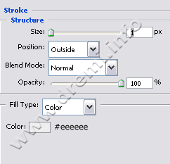
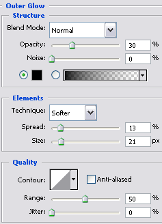
kasi style na:


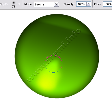
bwat layer baru, ambil tool brush, untuk dasarna gunakan warna hijau muda, ukuran brush: 50-70 px, mode: normal


untuk yang kedua kalinya ubah ukuran brush menjadi 30 px, tapi kali ini kurangi opacityna menjadi 60%, dengan warna putih


gunakan dodge tool untuk nerangin bagian brush na


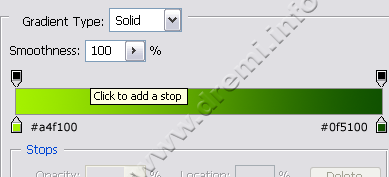
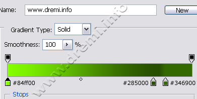
bwat satu elipse lagi di tengah na, dengan gradasi ke gini:


mode radial, tarik dari kiri atas ke kanan bawah:


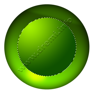
kembali bikin layer baru, gunakan brush warna hijau muda, bwat nerangin bagian gradasi hijau di kiri atasna.


brush yang kedua menggunakan warna putih


untuk bikin lingkaran elipse di atasna gw kasi lagi shape sama besar, dengan style gradasi radial abu-putih


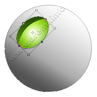
bikin satu elipse lagi diatasna, tapi kali ini gunakan mode shape substract (atow sambil nge-shape pencet ALT)


klik objek substract shape na make path selection tool, biar bisa ditransform rotate [baru CTRL+T], miringin dlu biar ke gini:


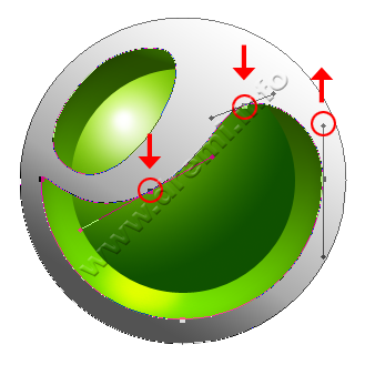
edit point na make convert point tool, atur biar ke gini:


bwat satu lagi elipse, tapi kali ini harus hati hati... dalam mengatur titik path na, gunakan convert point tool juga.


kasi gradasi abu putih bwat latar na


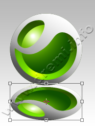
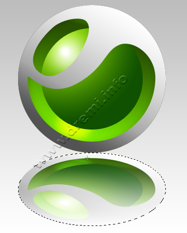
woke, gw cuma kasi efek bayangan refleksi aja, duplikat dan transform vertical


kasi gradasi transparent bwat bayangan smooth


apus dikit layer duplikat bayangan na pake eraser tool


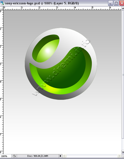
gw kasi text na, jadi dah..


Sony Ericsson Logo


uhuii... mudah2an setelah ini tutorial gw ga di kopi sembarangan, kalo mau ngopi, author link dan statement di footer na jangan dihapus yaa :(


gw begadang trus smaleman bwat bikin tutor na, biar tmen2 pada bisa belajar, woke selamat mencoba..


© Copyright 2008 www.dremi.info
Original Post: Sony Ericsson Logo Category: Interface
About the Author: dr.emi is a free man to distribute anything that he was founded. As a Webmaster He was publishing www.dremi.info to create one community that loves free idealism. Very specialy in Design Category. Welcome to love it!

Sumber dari situs Ilmu Website dalam kategori photoshop dengan judul Sony Ericsson Logo

Cool 3D Logo


bwat bikin 3d di photoshop itu sbnernye gampang banged, hmm... kata tmen2 sih rada susah, tapi ada banyak carana, ke tutorial ini niiii... nyok kita bikin logo bernuansa 3d


siapin canvas 400 x 400 px.


ambil salah satu shape di photoshop. gambar objek na.


COWO BANGET kan ??? gagagaagagakakkkkk :D


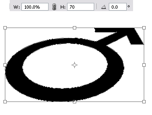
transform pake perspektiv ...


teken enter.


transform lagi, tapi kali ini khusus tinggina sajah, menjadi 70 %


enter juga


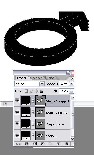
duplikat sekali, geser make panah ke atas. ulangi ampe beberapa kali, jadi keliatan tebel 3d na


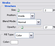
klik pada layer teratas, kasi style ke gini:


woke, beralih ke base shape paling dasar. kasi style juga


untuk kesan glossy, kasi gradasi transparent. [CTRL+Click] pada layer shape paling atas, pilih menu Select > Modify > Contract ( 2px )


kurangi opacity na....


delete sebagian gradasi make marquee tool....


ubah blending mode layer menjadi overlay


jadi dah... hahahahakkk


© Copyright 2008 www.dremi.info Original Post: Cool 3D Logo Category: Interface
About the Author: dr.emi is a free man to distribute anything that he was founded. As a Webmaster He was publishing www.dremi.info to create one community that loves free idealism. Very specialy in Design Category. Welcome to love it!

Sumber dari situs Ilmu Website dalam kategori photoshop dengan judul Cool 3D Logo